Hi Everyone,
First some house keeping – This will be the last, direct email blast Release Notes. We have a brand new website which, if you haven’t seen is amazing: https://workzilla.co/. We now have resources including our videos, a knowledge hub, a blog and our release notes. If you want to get notified of new releases you can sign up as a subscriber to the release notes through the website at https://workzilla.co/release-notes/.
Today’s release includes:
Standard > My Portfolio Overhaul
The My Portfolio page was an under-utilised space that didn’t offer much functionality. We have upgraded this space and it should now be a good home for any fee earner who is tasked with matter responsibilities.
We have retained the “Total Active Matters” from the old page and it now utilises our new context panel structure to display all the matters that are open for which the user is responsible.
We have then included the following dashboard widgets:
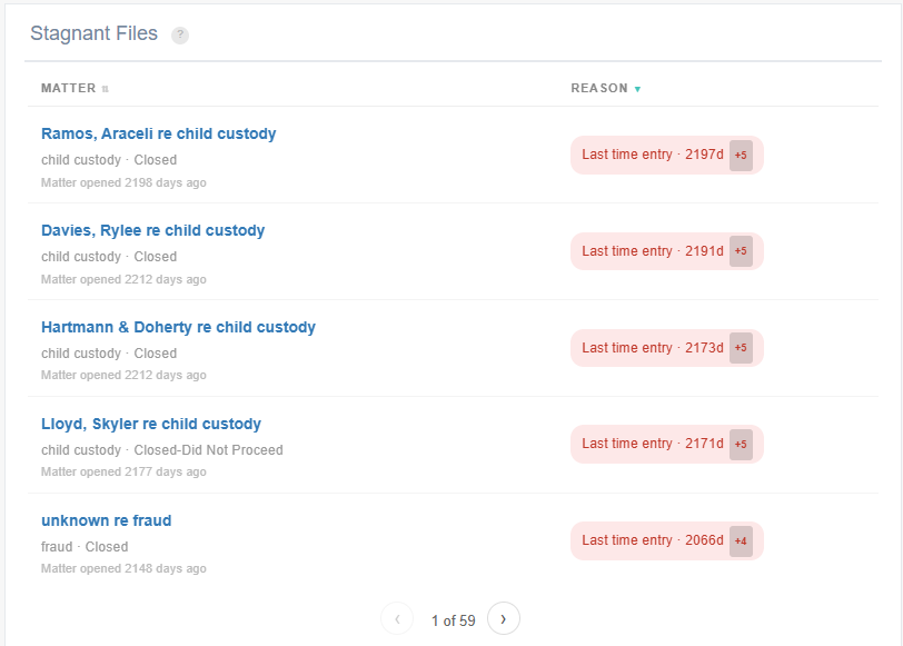
Stagnant files – this widget will display all the matters that have fallen stagnant according to the rules set out by the organisation in Company Customisation. This widget also allows the user to see all the rules set up by the organisation so they can understand why files might be showing up here.
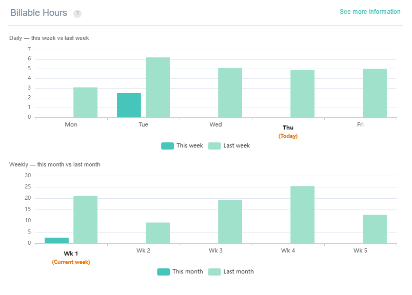
Billable Hours – this is a utilisation chart which breaks down utilisation by day for the last two weeks and by week for the last two months. A handy little guide which should not be used to replace the more in-depth performance views.
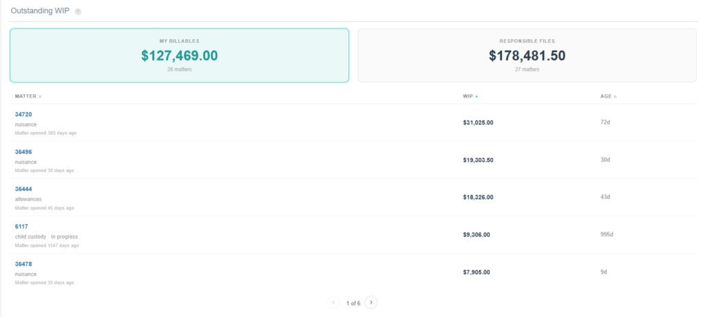
Outstanding WIP – this widget will guide the user to all their own timesheets that are outstanding and all the timesheets sitting on files for which they are responsible.
We will continue upgrading this page over the coming weeks with the intention that this becomes a hub for fee earners; a page they come back to time and again and helps drive accountability and efficiency.
Quality of life changes to Profitability
- Calculation warnings is now collapsed and can be expanded if you would like to see the warnings.
- Clicking anywhere on the space around a line on the chart will bring up the context panel, you no longer need to click the actual bar itself.
Quality of life changes to Comparative Reporting
- We have removed the delta as the option that appears when you select two data points. Sorry to everyone who liked it but the consensus was it was too confusing.
- You can now compare staff members even when only one data point is selected.
- Comparison charts now line up with the comparison tables for a cleaner view.
- When not viewing individual day data as opposed to accumulative it now appears as a bar chart instead of a line chart.
Quality of life changes to Stagnation
- We have added back in the rule explanation to each card.
Multiple team member selection in targets
We are making some changes to how managers can view targets. Our very first pass at this is to allow managers to select any number of staff for the page and the page will display their targets stacked and arranged by individual. You can also filter by target type (billable fees, collected fees etc) and the filter will only show options that have been used for the individuals selected.
This is our first pass at this but expect more in the next release.